Create an infographic inspired by Giorgia Lupi's approach to data visualization. Start by analyzing her methodology and taking detailed notes on her unique interpretation of data. Then, apply her principles to design an infographic
About Georgia Lupi
Infographic
About Dear data
Dear Data infographic
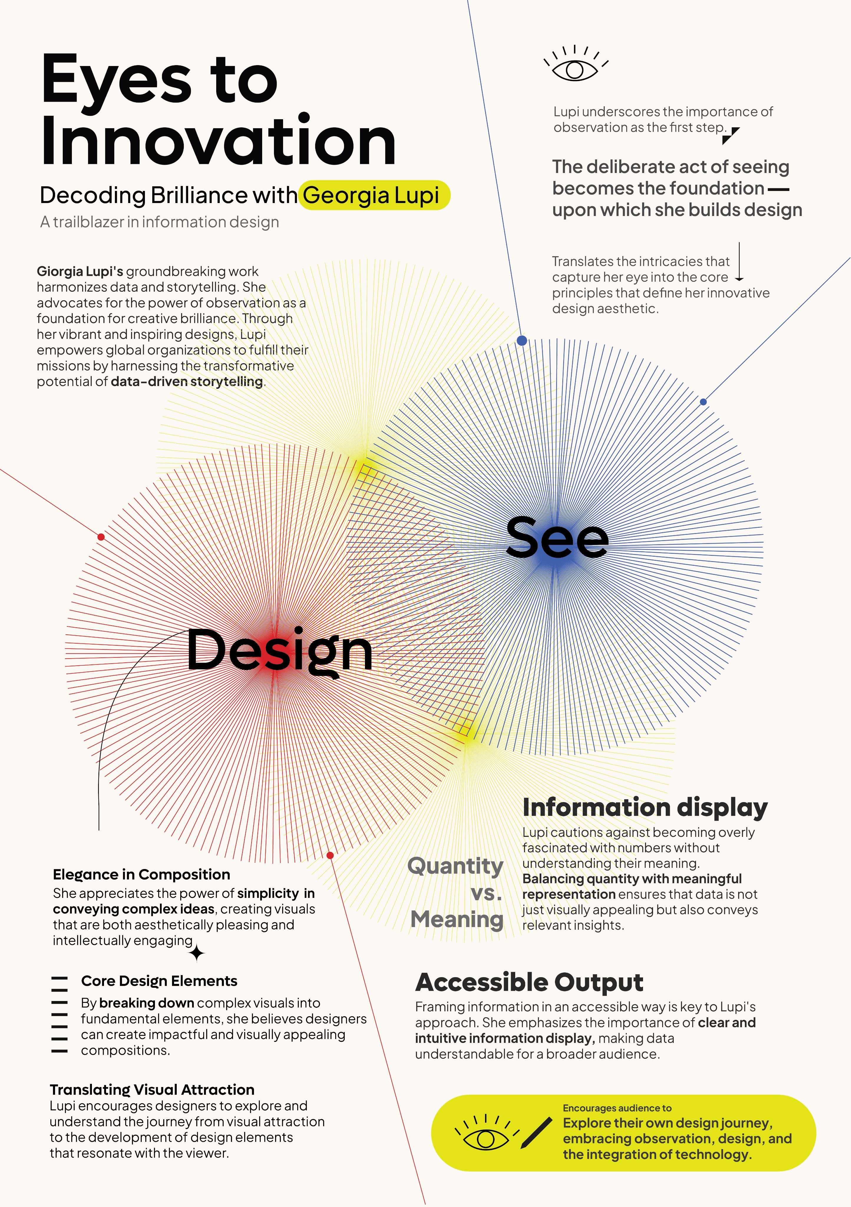
Giorgia Lupi’s work highlights the deep connection between observation and design. She believes that observation is the foundation for creativity, enabling data to tell meaningful stories.
The infographic explores her concept by showing how careful observation transforms raw data into visually engaging designs that inspire and inform. It emphasizes that observation and design must work together to create impactful, human-centered storytelling.
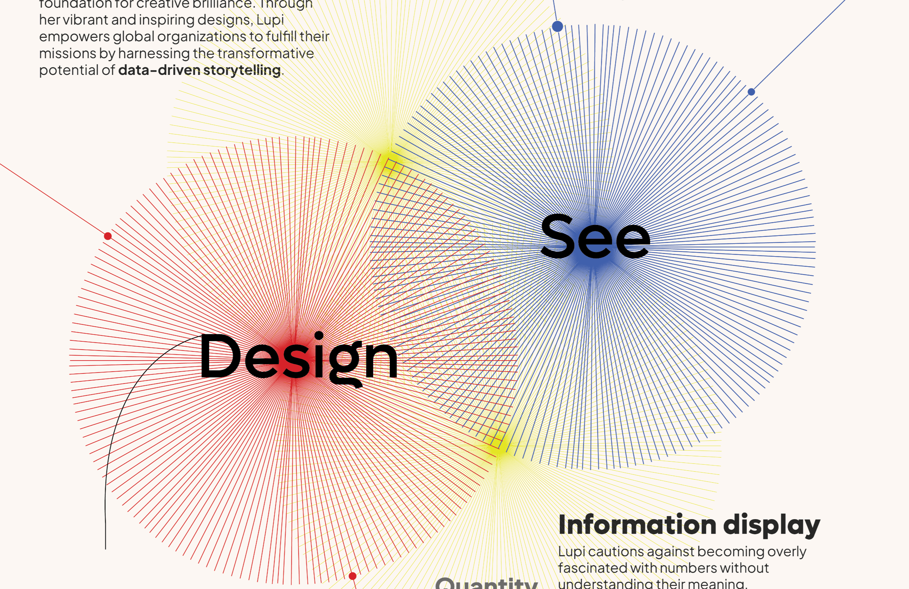
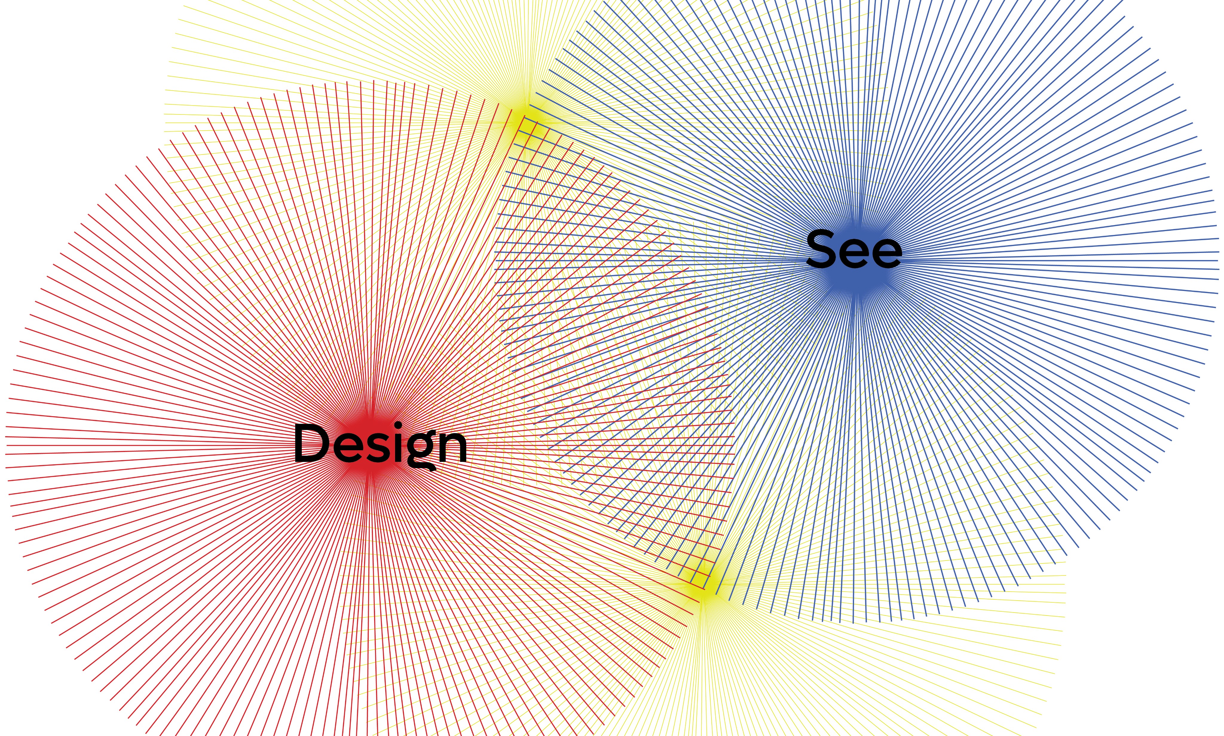
The visual of two overlapping circles, one labeled "See" and the other "Design," represents Giorgia Lupi's idea that observation and design are interconnected.
The overlap, forming a new Pattern, symbolizes the fusion of these two elements. It illustrates how observing data ("See") and creatively interpreting it ("Design") come together to create impactful and meaningful storytelling.
Dear data
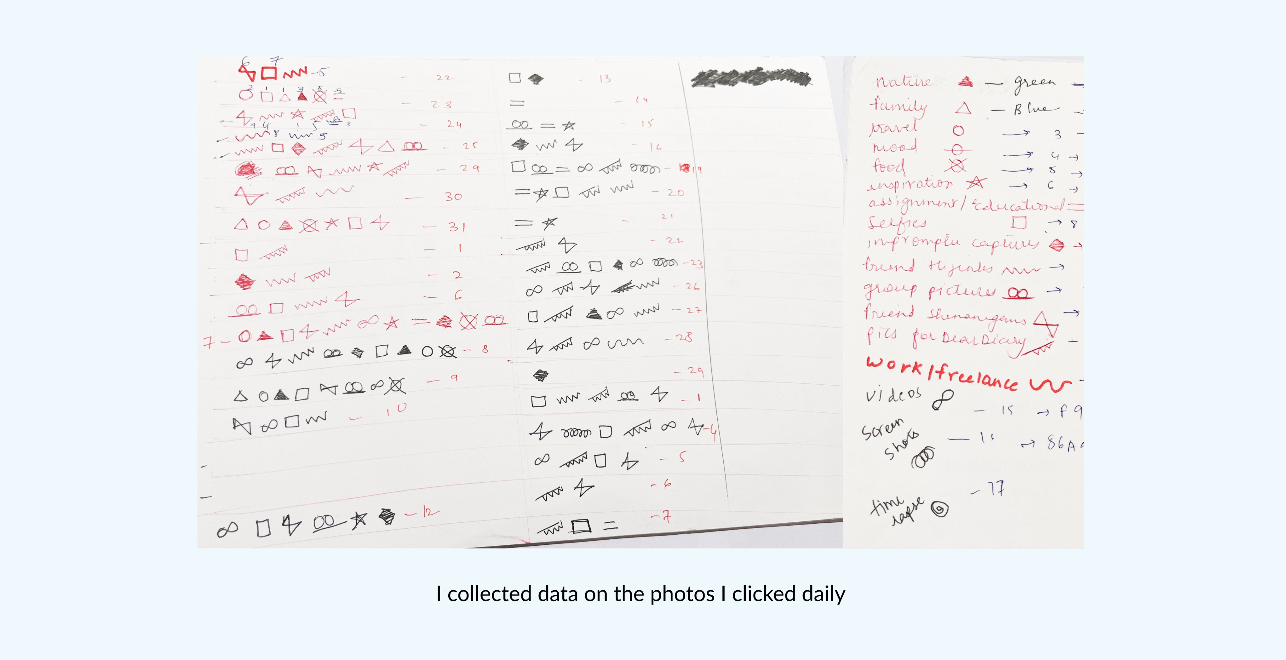
Drew inspiration from Giorgia Lupi's Dear Data, where we collected personal data from our daily actions over a month and creatively visualized it in unique and engaging ways.
Inside the lens
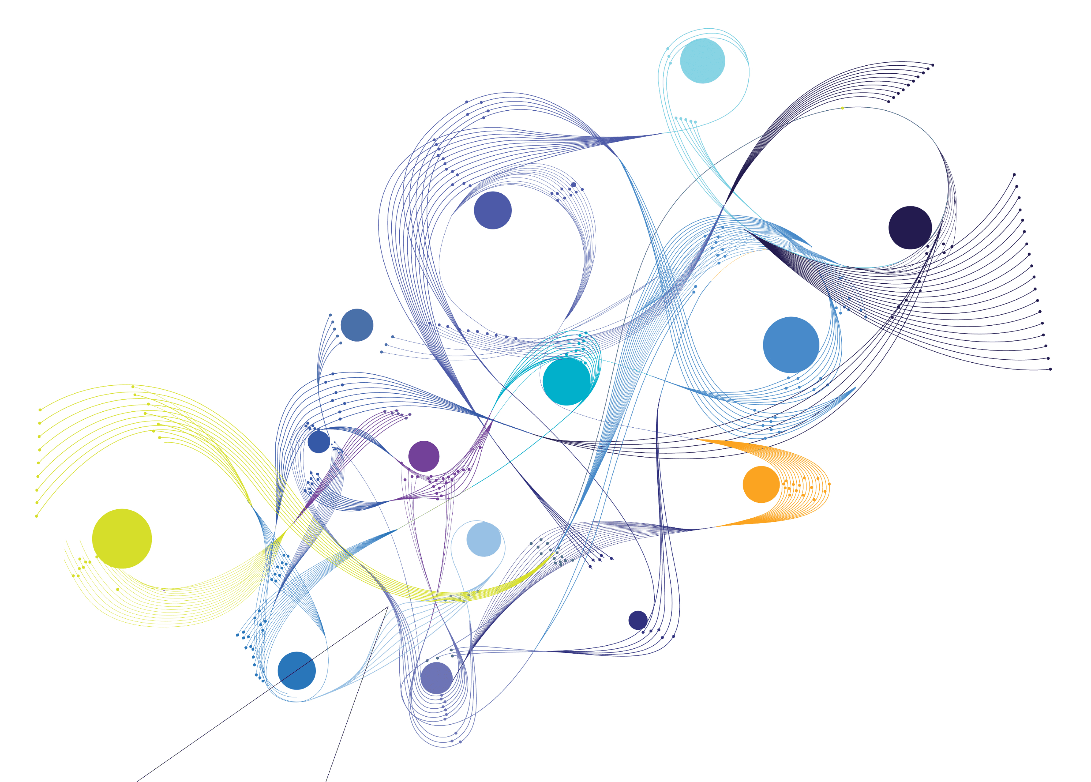
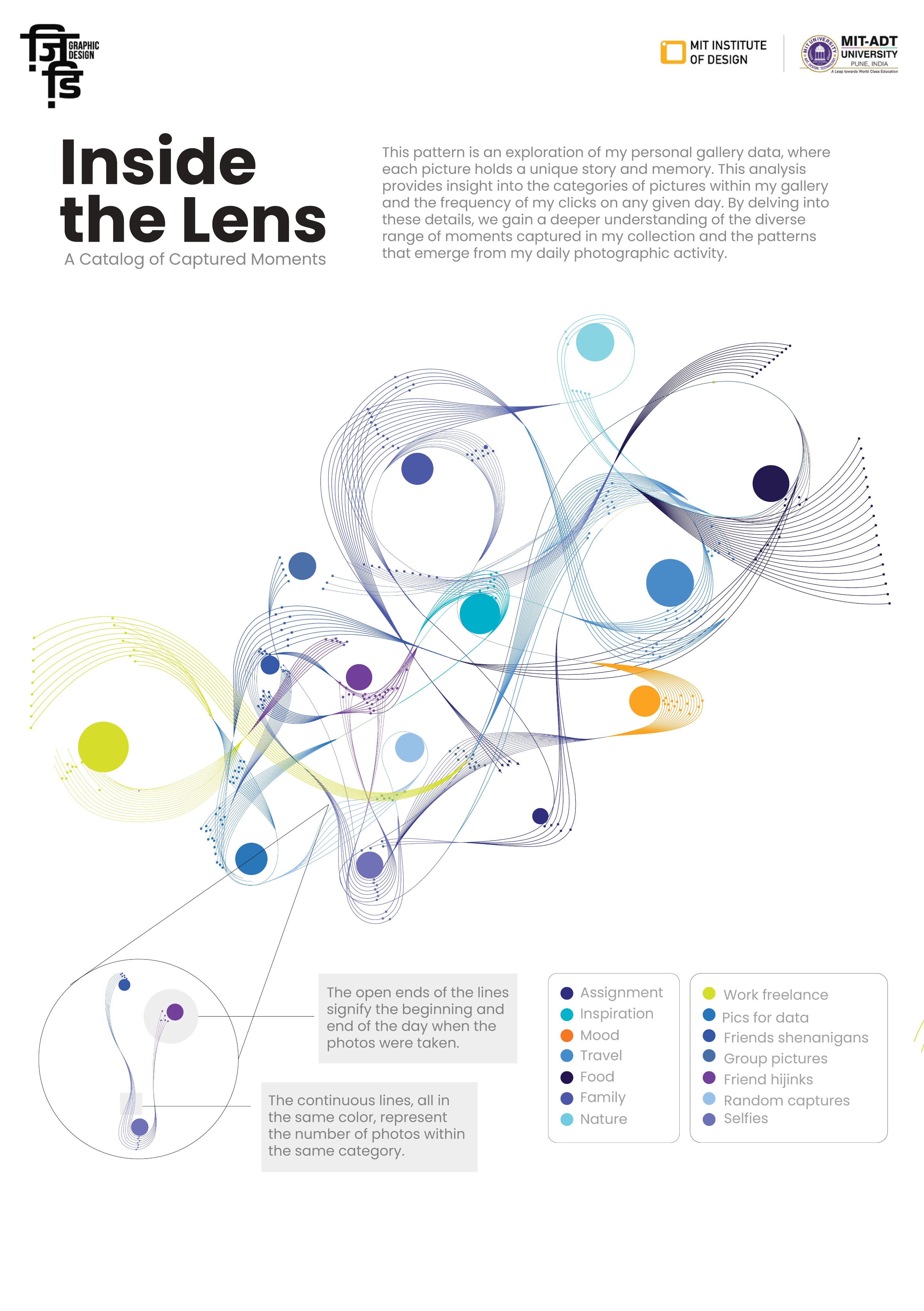
This pattern is an exploration of my personal gallery data, where each picture holds a unique story and memory. This analysis provides insight into the categories of pictures within my gallery and the frequency of my clicks on any given day. By delving into these details, we gain a deeper understanding of the diverse range of moments captured in my collection and the patterns that emerge from my daily photographic activity.
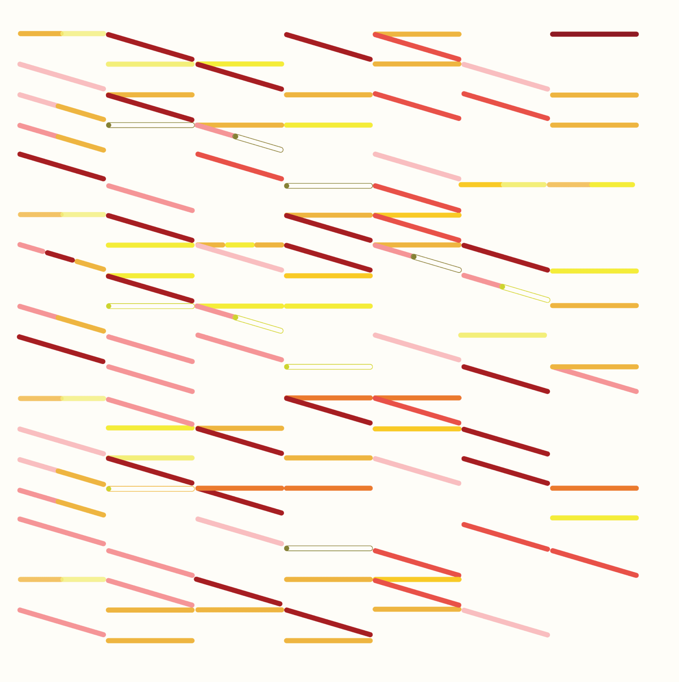
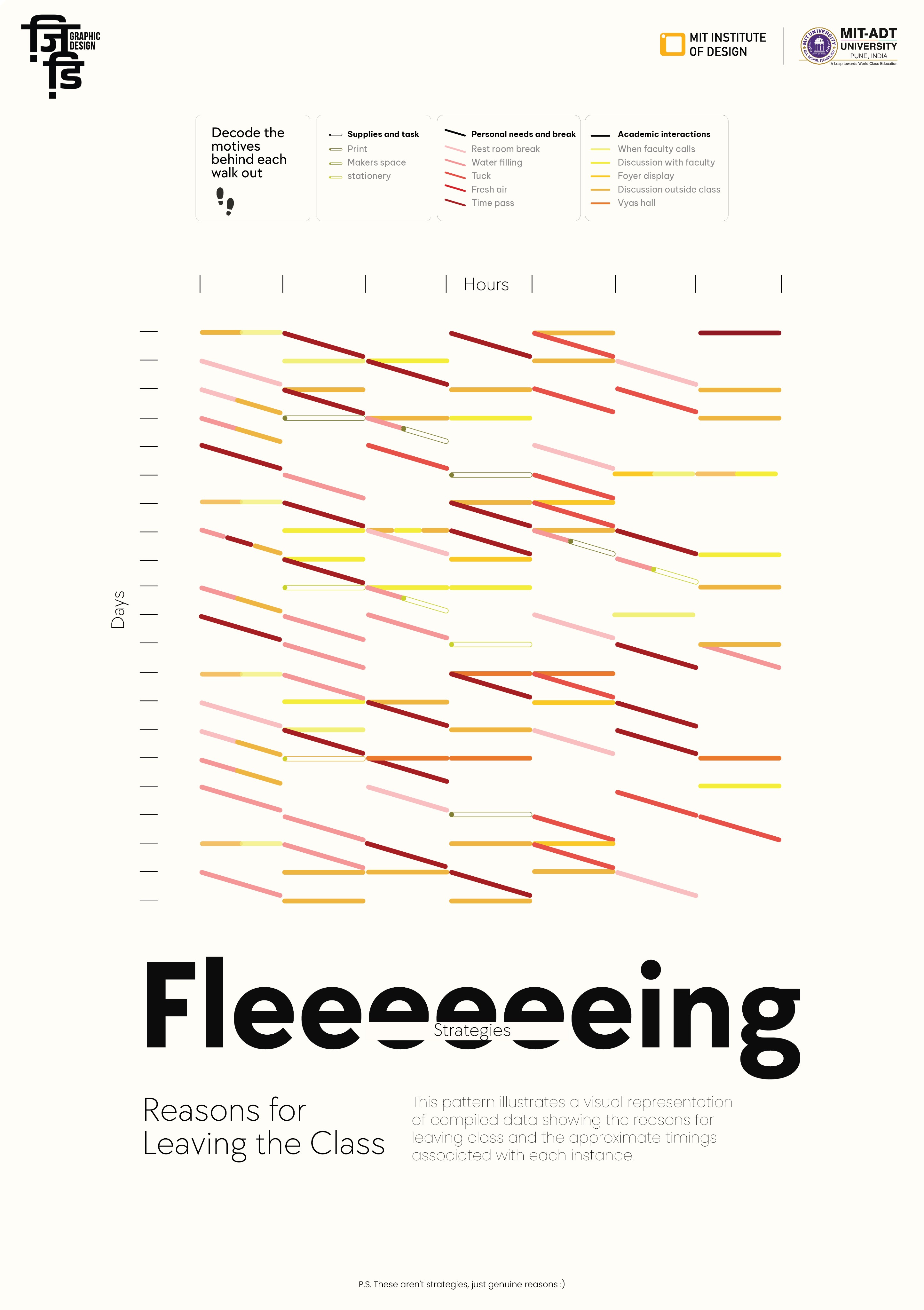
Fleeeeeeeing Strategies
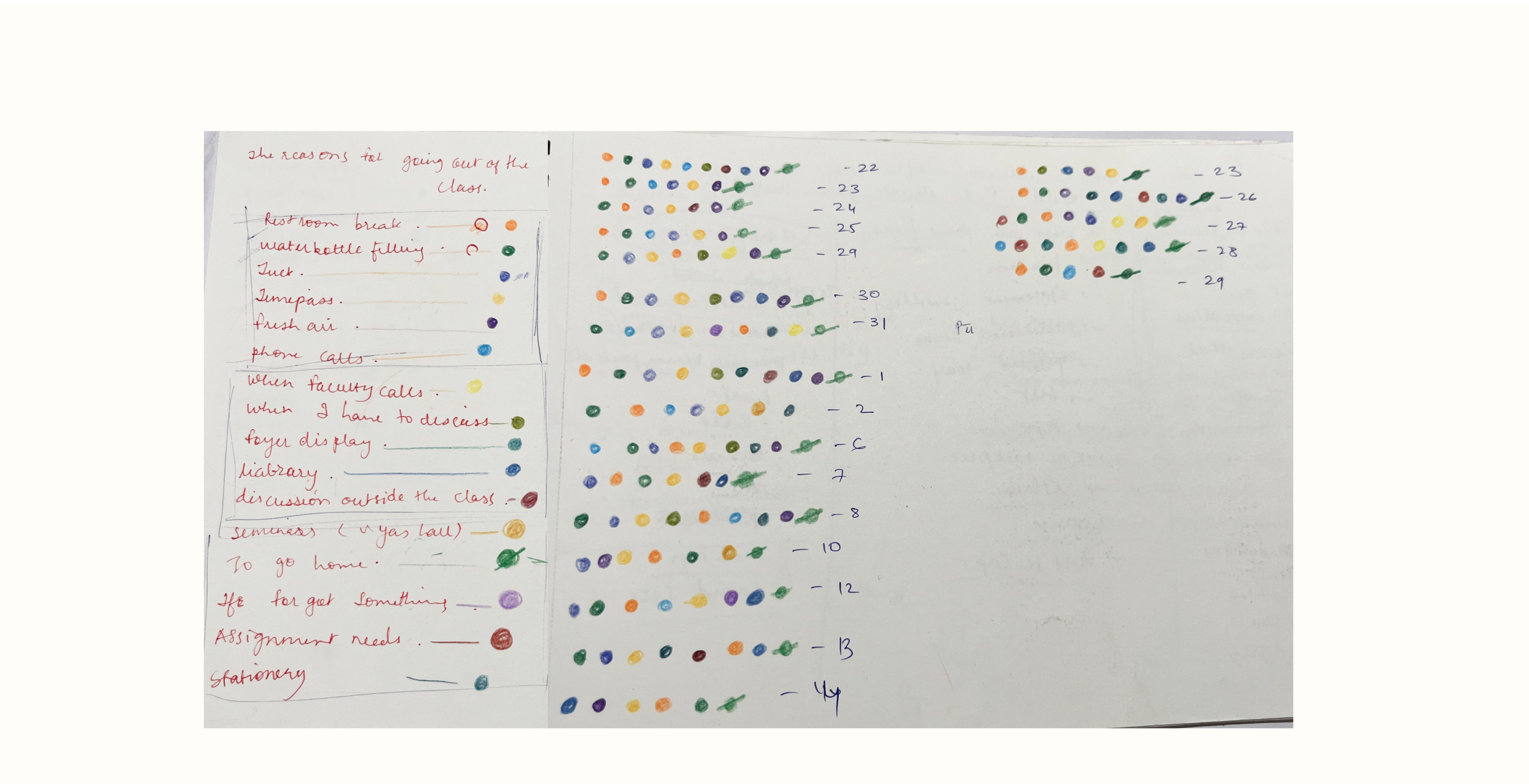
This pattern illustrates a visual representation of compiled data showing the reasons for leaving class and the approximate timings associated with each instance.
